Client
BlueTape is a financing business . They offer a payment and financing solution for construction professionals: building material dealers, distributors, manufacturers, builders, contractors, and architects to name a few. Their mission is to improve their customers' experience, by helping to cut operation costs, and enable them to run their business more efficiently, all with an easy-to-use and innovative solution.
... Here is where the product is needed.
Problem
The client wants to improve the work experience for people in the construction business. The product, a payment and financing platform, needs to have a more smooth and easy to navigate process for accessing the product's services.

Solution
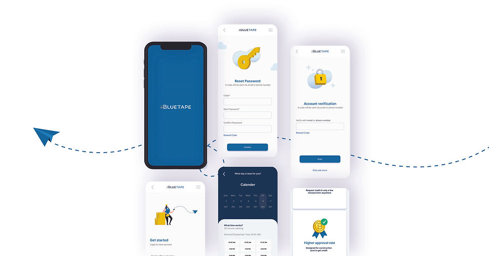
Improve the experience of the user by rebranding the product to visually and functionally reflect the goal of making it efficient for users to access financing and payment options using the application and website. Thinking particularly of the user base, using a newer appealing look with more consistency.

Approach
The design process required a selection of steps catered to the user's needs, concerns and comfortability. It includes interviews, open ended questions, understanding and finding pain-points and iterating for continuous usability studies. Then the remaining steps in an agile method.

I conducted 8 user interviews to find new information and commonalities in the current user experience with the product. Some were moderated and some were un-moderated. For this I used Zoom, (video call) as well as in person interviews and provided the users with a list of general tasks to perform while using the product.
Some key new discoveries were:
-
Dullness in the features
-
Difficulty finding information
-
Questioning "security" of the service
Research

Persona

Define
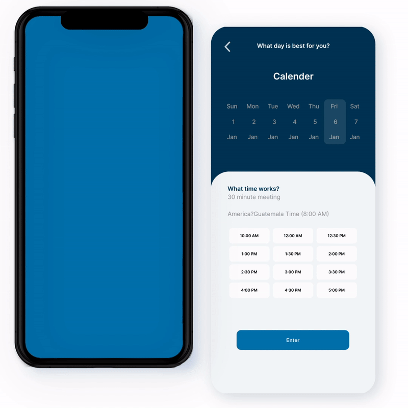
After collecting data and feedback from users, enough details were received to create user flows, wireframes and select colours for the brand consistency. This was all done using Adobe Creative Suite as well as Figma, Procreate, and of course plain old pen and paper.
Design

Colour Palette

Prototype